새로운 강의는 이제 https://memi.dev 에서 진행합니다.
memi가 Vue & Firebase로 직접 만든 새로운 사이트를 소개합니다.
모던웹(NEMV) 혼자 제작 하기 3기 - 82 대시보드 꾸며보기
대시보드에 적절한 위젯들을 배치하고 꾸며봅니다.
개요
대시보드는 보통 관리자페이지(어드민패널)로 많이 처리합니다.
차트나 합계 숫자들이 있어야 디자인이 사는데 내용이 관리자 통계용으로나 적합하기 때문이죠..
뷰티파이로 만든 대시보드 탬플릿이 있길래 확인해봤습니다.
뷰티파이 대시보드 탬플릿
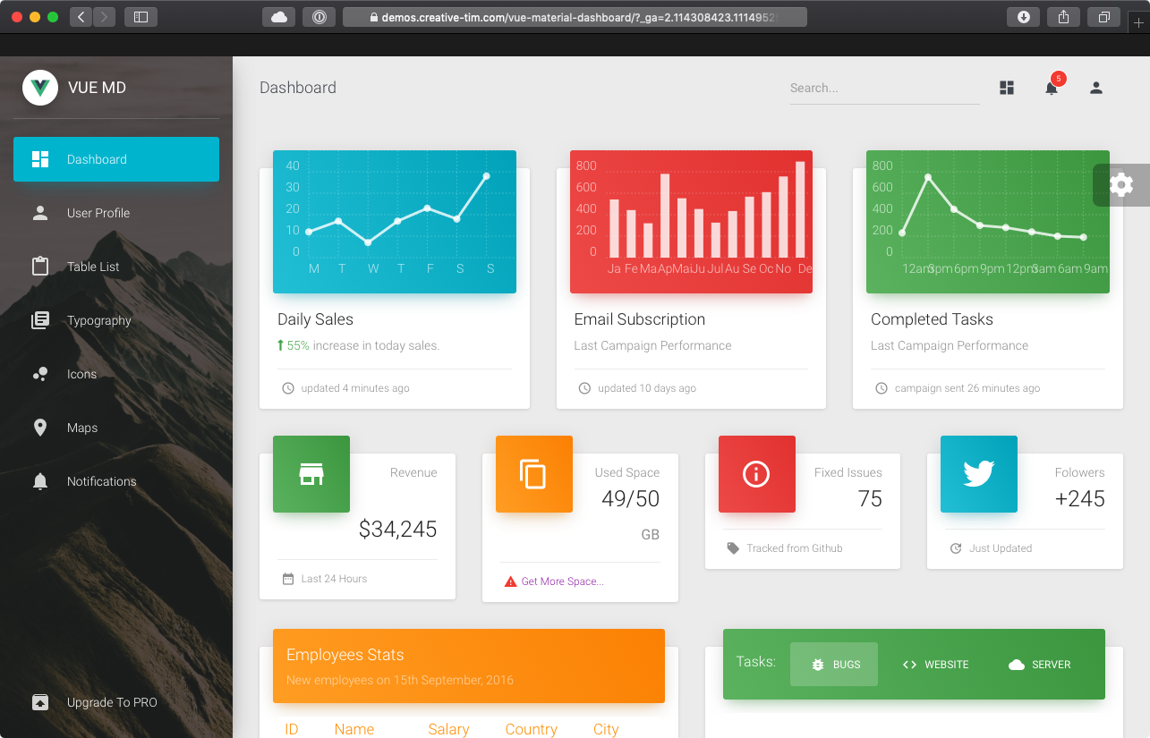
$59 면 프로 구매가 가능하다고 나오네요~
링크에 가서 둘러보시면 어떤 느낌인지 알 수 있습니다.
디자인에 대한 견해
위의 탬플릿도 훌륭하긴 하지만 너무 화려한 감이 있기는 하죠..(호불호가 있을 디자인)
디자인 전공은 아니지만.. 당연한 중요 요소들은 3가지 정도라 생각합니다.
- 배치
- 폰트
- 색상
화려한 색깔과 라운딩도 좋지만.. 가끔 플랫한 흰바탕에 검은 글씨만 적혀있는 것이 더 나을 수 있습니다.
대부분의 공룡기업들(애플, 구글, 트위터등)이 심플한 UI로 바뀌었죠..(애플은 원래 그랬었고..)
비슷해 보이지만 글씨가 짙은 회색인지 검은색인지는 전체적인 샷을 봤을 때 매우 느낌이 다릅니다.
심플한 UI(머터리얼)의 경우 아무것도 없이 글씨만 있으니 얼마나 중요하겠습니까?
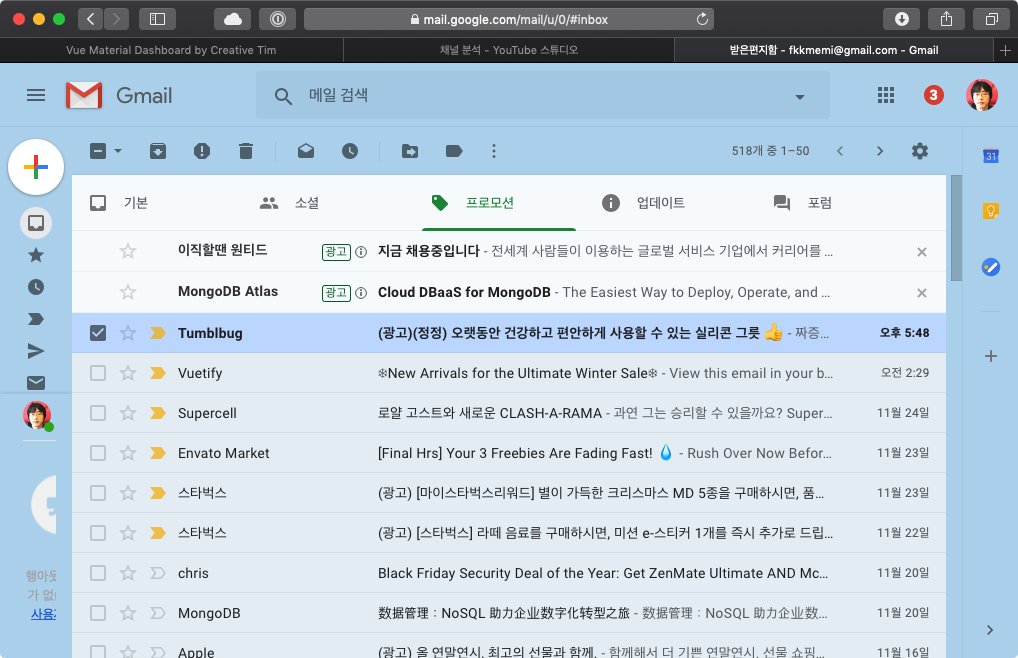
훌륭한 머터리얼 디자인은 늘 가까운 곳에서 흔히 볼 수 있습니다.
바로 구글이 운영하는 사이트들을 확인하면 됩니다.
gmail
유튜브 스튜디오
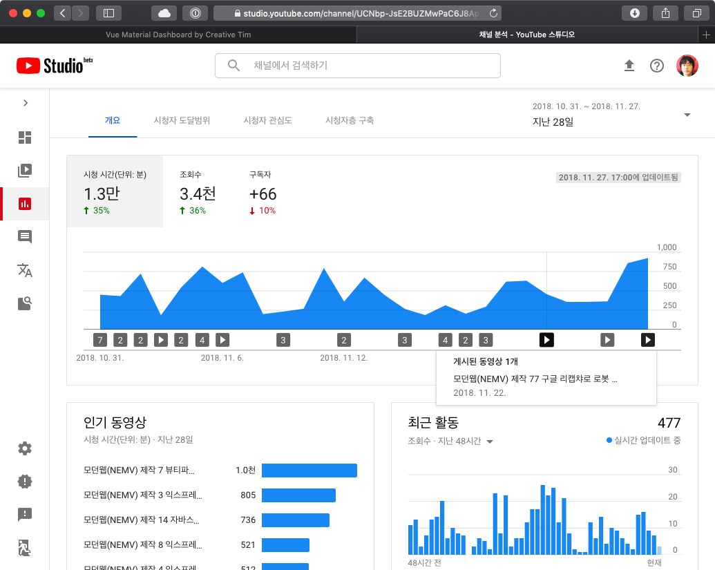
엄청 이쁘진 않지만 심플의 미학을 담고 있고 어느 곳을 강조하고 있는 지 명확합니다.
머터리얼 디자인의 만든 회사니.. 머터리얼 디자인 가이드라인 준수율 99%겠죠~
머터리얼 디자인 가이드라인은 상당히 복잡합니다.
하지만 복잡한 가이드라인을 한땀한땀 읽을 필요 없습니다.
바로 뷰티파이 자체가 머터리얼 디자인이기 때문이죠.
배치만 잘해주고 어울리게 사용하면, 판매하기 위해 화려한 스타일 오버라이드된 상용 대시보드보다 더 나을 수도 있습니다.
디자인 잘하지 못해서.. 뷰티파이의 힘을 빌려 볼만한 정도로만 구성해보겠습니다.
작전
- 레이아웃을 잡는다.(v-flex)
- 작은 카드 4개 상단에 배치
- 차트 카드 3개 중간에 배치
- 게시판 카드 2개 하단에 배치
위의 예시와 비슷한 배치로 만드는 것이죠..
먼저 api 없이 껍데기를 만들고 api를 구상해보면 됩니다.
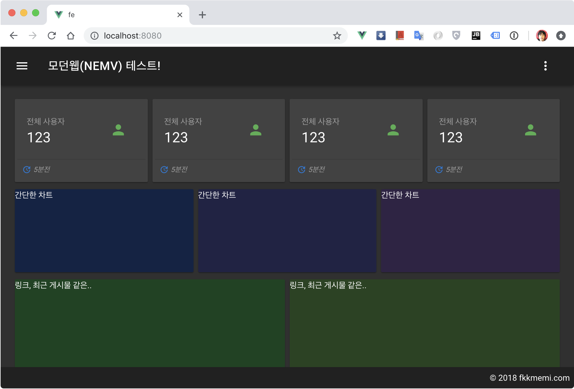
빈 카드로 레이아웃 잡기
fe/src/views/dashboard/index.vue
<template>
  <v-container fluid :grid-list-md="!$vuetify.breakpoint.xs">
    <v-layout wrap row>
      <v-flex xs12 sm6 md3 class="pb-2" v-for="i in 4">
        <v-card height="130px" :color="`#${i}00000`">
          각종 현황
        </v-card>
      </v-flex>
      <v-flex xs12 sm4 class="pb-2" v-for="i in 3">
        <v-card height="140px" :color="`#${i}12345`">
          간단한 차트
        </v-card>
      </v-flex>
      <v-flex xs12 sm6 class="pb-2" v-for="i in 2">
        <v-card height="290px" :color="`#${i}54321`">
          링크, 최근 게시물 같은..
        </v-card>
      </v-flex>
    </v-layout>
  </v-container>
</template>
적용 화면
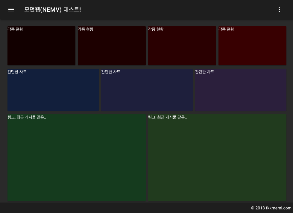
모바일 태블릿 데스크탑 사이즈로 창크기를 왔다갔다 하면서 의도에 맞는 배치인지 확인해봅니다.
내용 채워서 배치하기
빈 레이어로는 느낌을 잡기가 힘듭니다.
뭔가 채워야 어떤 느낌인지 알 수 있습니다.
작은 카드 만들기
콤포넌트로 만들기 전에 내용을 아무렇게나 채워서 채워봅니다.
fe/src/views/dashboard/index.vue
<template>
<v-container fluid :grid-list-md="!$vuetify.breakpoint.xs">
<v-layout wrap row>
<v-flex xs12 sm6 md3 class="pb-2" v-for="i in 4">
<v-card>
<v-container pa-1>
<v-layout row>
<v-flex xs7>
<v-card-title primary-title>
<div>
<div class="grey--text">전체 사용자</div>
<h3 class="headline">123</h3>
</div>
</v-card-title>
</v-flex>
<v-flex xs5>
<v-card-title primary-title>
<v-avatar>
<v-icon medium color="success">person</v-icon>
</v-avatar>
</v-card-title>
</v-flex>
</v-layout>
<v-divider light></v-divider>
<v-card-actions class="pa-2">
<v-icon small color="primary">update</v-icon>
<span class="grey--text caption font-italic"> 5분전</span>
<v-spacer></v-spacer>
</v-card-actions>
</v-container>
</v-card>
</v-flex>
<!-- -->
</template>
적용 화면
- v-card 안에서 v-container 친구들로 모양을 내기 위해 7:5로 공간을 분리했습니다.
- v-contaniner에 pa-1을 준 이유는 v-divider가 양 옆에 여백이 있어야 예쁘기 때문입니다.
- 전체사용자는 회색글씨로 강조를 줄이고 headline 클래스로 숫자에 집중시켰습니다.
- v-avatar로 v-img를 감싼 이유는 가운데 정렬 문제 때문입니다.
- 하단 v-card-actions에 덜 중요한 정보를 회색 폰트로 처리했습니다.
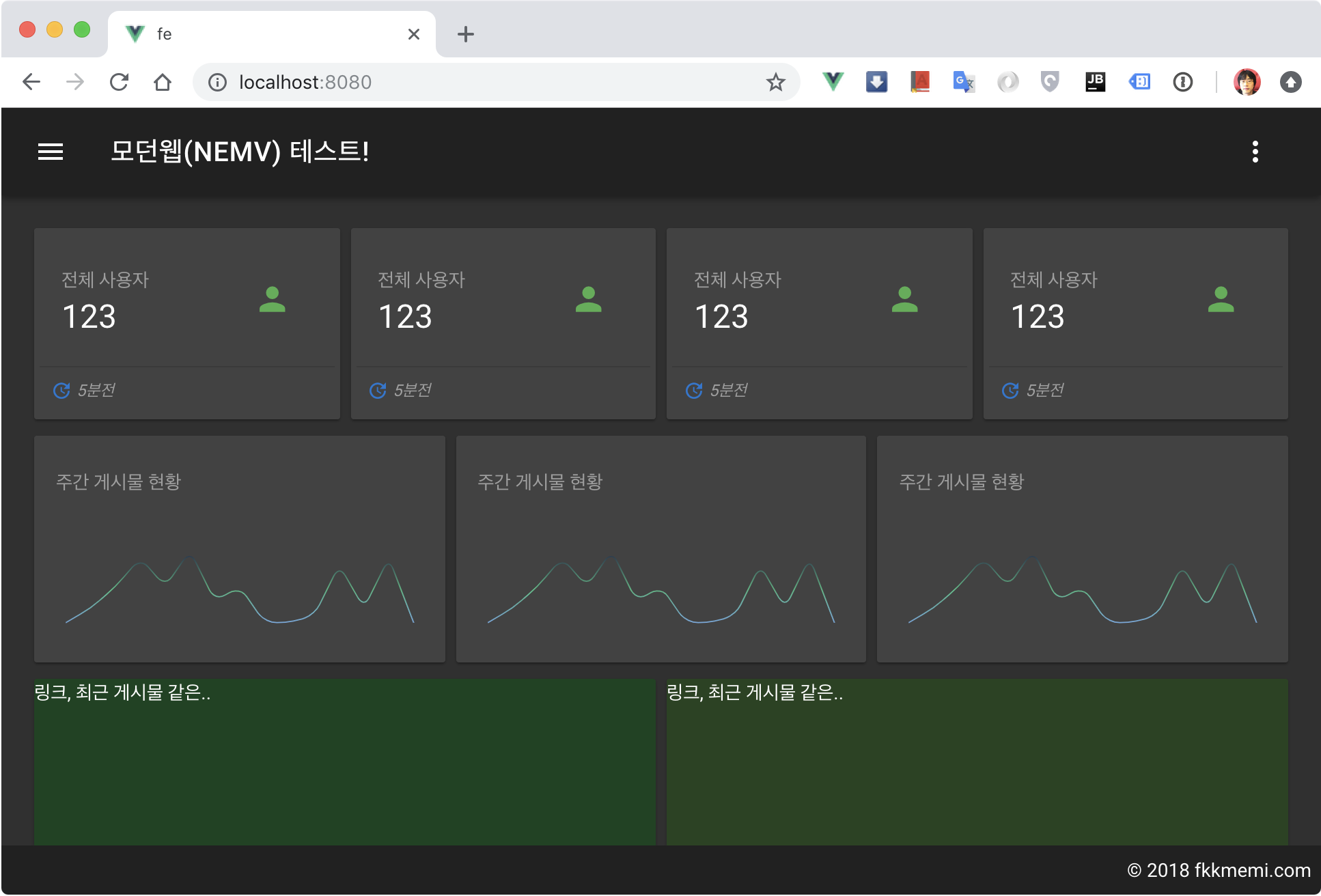
차트 카드 만들기
차트 설치
실제 값을 볼 필요 없이 추이만 보는데 쓰이는 차트를 보통 스파크라인이라고 합니다.
제일 유명한 vuetrend를 설치해보겠습니다.
참고: https://github.com/QingWei-Li/vue-trend
$ cd fe && yarn add vuetrend
전역 등록
fe/src/main.js
// ..
import VueAnalytics from 'vue-analytics'
import Trend from 'vuetrend'
// ..
Vue.use(Trend)
이제 어느 페이지에서나 사용 가능합니다.
예제로 차트 카드 채우기
fe/src/views/dashboard/index.vue
<template>
  <v-container fluid :grid-list-md="!$vuetify.breakpoint.xs">
    <v-layout wrap row>
      <!-- -->
      <v-flex xs12 sm4 class="pb-2" v-for="i in 3">
        <v-card>
          <v-card-title primary-title>
            <span class="grey--text">주간 게시물 현황</span>
          </v-card-title>
          <v-card-text>
            <trend
              :data="[0, 2, 5, 9, 5, 10, 3, 5, 0, 0, 1, 8, 2, 9, 0]"
              :gradient="['#6fa8dc', '#42b983', '#2c3e50']"
              auto-draw
              smooth>
            </trend>
          </v-card-text>
        </v-card>
      </v-flex>
      <!-- -->
</template>
뷰트렌드는 data에 배열 값만 넣으면 끝입니다.(그라디언트는 옵션.. 그 밖에 옵션은 공식 홈에서 확인)
적용 화면
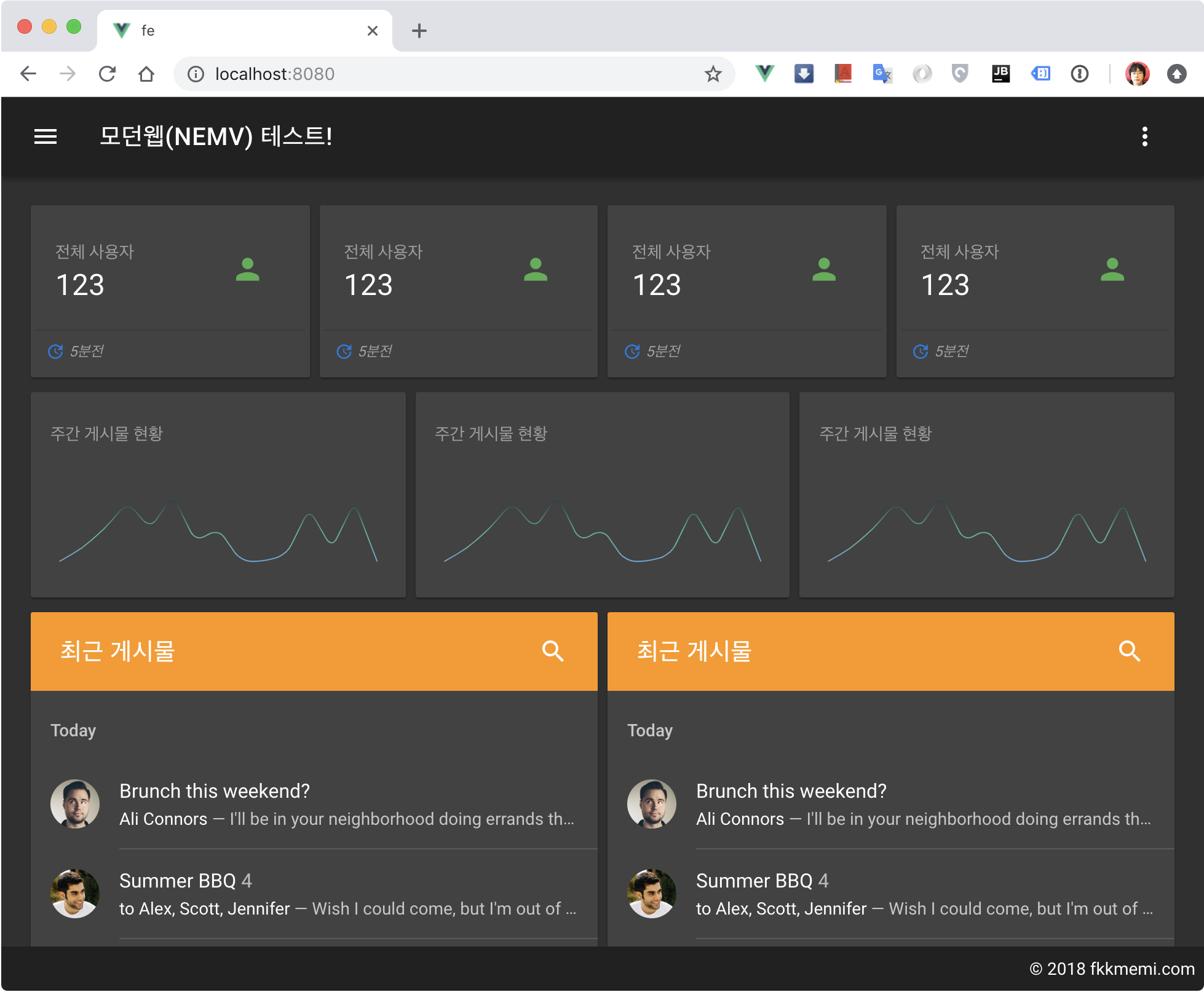
게시판 카드 만들기
지난번에 탭(v-tab)에 만들었다면 이번에는 리스트로 만듭니다.
참고: https://vuetifyjs.com/ko/components/lists
모양만 내는 것이기 때문에 예제 소스코드를 그대로 배껴서 표현해봅니다.
fe/src/views/dashboard/index.vue
<template>
<v-container fluid :grid-list-md="!$vuetify.breakpoint.xs">
<v-layout wrap row>
<!-- -->
<v-flex xs12 sm4 class="pb-2" v-for="i in 3">
<v-card>
<v-toolbar color="orange" flat>
<v-toolbar-title>최근 게시물</v-toolbar-title>
<v-spacer></v-spacer>
<v-btn icon>
<v-icon>search</v-icon>
</v-btn>
</v-toolbar>
<v-list two-line>
<template v-for="(item, index) in items">
<v-subheader
v-if="item.header"
:key="item.header"
>
{{ item.header }}
</v-subheader>
<v-divider
v-else-if="item.divider"
:inset="item.inset"
:key="index"
></v-divider>
<v-list-tile
v-else
:key="item.title"
avatar
@click=""
>
<v-list-tile-avatar>
<img :src="item.avatar">
</v-list-tile-avatar>
<v-list-tile-content>
<v-list-tile-title v-html="item.title"></v-list-tile-title>
<v-list-tile-sub-title v-html="item.subtitle"></v-list-tile-sub-title>
</v-list-tile-content>
</v-list-tile>
</template>
</v-list>
</v-card>
</v-flex>
<!-- -->
</template>
<script>
export default {
data () {
return {
items: [
{ header: 'Today' },
{
avatar: 'https://cdn.vuetifyjs.com/images/lists/1.jpg',
title: 'Brunch this weekend?',
subtitle: "<span class='text--primary'>Ali Connors</span> — I'll be in your neighborhood doing errands this weekend. Do you want to hang out?"
},
{ divider: true, inset: true },
{
avatar: 'https://cdn.vuetifyjs.com/images/lists/2.jpg',
title: 'Summer BBQ <span class="grey--text text--lighten-1">4</span>',
subtitle: "<span class='text--primary'>to Alex, Scott, Jennifer</span> — Wish I could come, but I'm out of town this weekend."
},
{ divider: true, inset: true },
{
avatar: 'https://cdn.vuetifyjs.com/images/lists/3.jpg',
title: 'Oui oui',
subtitle: "<span class='text--primary'>Sandra Adams</span> — Do you have Paris recommendations? Have you ever been?"
}
]
}
},
// ..
}
</script>
적용 화면
카드들 콤포넌트로 만들기
반복되는 요소들은 뷰의 장기중 하나인 나만의 콤포넌트로 래핑(eg:기능 바꾼 카드)해두면 코드의 난잡함을 줄일 수 있습니다.
스몰 카드 콤포넌트
fe/src/components/dashboard/smallCard.vue
<template>
<v-card>
<v-container pa-1>
<v-layout row>
<v-flex xs7>
<v-card-title primary-title>
<div>
<div class="grey--text">{{title}}</div>
<h3 class="headline">{{number}}</h3>
</div>
</v-card-title>
</v-flex>
<v-flex xs5>
<v-card-title primary-title>
<v-avatar>
<v-icon medium :color="tIconColor">{{tIcon}}</v-icon>
</v-avatar>
</v-card-title>
</v-flex>
</v-layout>
<v-divider light></v-divider>
<v-card-actions class="pa-2">
<v-icon small :color="bIconColor">{{bIcon}}</v-icon>
<span class="grey--text caption font-italic"> {{bText}}</span>
<v-spacer></v-spacer>
</v-card-actions>
</v-container>
</v-card>
</template>
<script>
export default {
props: ['title', 'number', 'tIcon', 'tIconColor', 'bIcon', 'bIconColor', 'bText']
}
</script>
차트카드 콤포넌트
fe/src/components/dashboard/trendCard.vue
<template>
  <v-card height="100%">
    <v-card-title primary-title>
      <span class="grey--text">{{title}}</span>
    </v-card-title>
    <v-card-text>
      <trend
        :data="data"
        :gradient="gradient"
        auto-draw
        smooth>
      </trend>
    </v-card-text>
  </v-card>
</template>
<script>
export default {
  props: ['title', 'data', 'gradient']
}
</script>
게시판카드 콤포넌트
fe/src/components/dashboard/boardCard.vue
<template>
<v-card height="100%">
<v-toolbar color="orange" flat>
<v-toolbar-title>최근 게시물</v-toolbar-title>
<v-spacer></v-spacer>
<v-btn icon>
<v-icon>search</v-icon>
</v-btn>
</v-toolbar>
<v-list two-line>
<template v-for="(item, index) in items">
<v-subheader
v-if="item.header"
:key="item.header"
>
{{ item.header }}
</v-subheader>
<v-divider
v-else-if="item.divider"
:inset="item.inset"
:key="index"
></v-divider>
<v-list-tile
v-else
:key="item.title"
avatar
@click=""
>
<v-list-tile-avatar>
<img :src="item.avatar">
</v-list-tile-avatar>
<v-list-tile-content>
<v-list-tile-title v-html="item.title"></v-list-tile-title>
<v-list-tile-sub-title v-html="item.subtitle"></v-list-tile-sub-title>
</v-list-tile-content>
</v-list-tile>
</template>
</v-list>
</v-card>
</template>
<script>
export default {
data () {
return {
items: [
{ header: 'Today' },
{
avatar: 'https://cdn.vuetifyjs.com/images/lists/1.jpg',
title: 'Brunch this weekend?',
subtitle: "<span class='text--primary'>Ali Connors</span> — I'll be in your neighborhood doing errands this weekend. Do you want to hang out?"
},
{ divider: true, inset: true },
{
avatar: 'https://cdn.vuetifyjs.com/images/lists/2.jpg',
title: 'Summer BBQ <span class="grey--text text--lighten-1">4</span>',
subtitle: "<span class='text--primary'>to Alex, Scott, Jennifer</span> — Wish I could come, but I'm out of town this weekend."
},
{ divider: true, inset: true },
{
avatar: 'https://cdn.vuetifyjs.com/images/lists/3.jpg',
title: 'Oui oui',
subtitle: "<span class='text--primary'>Sandra Adams</span> — Do you have Paris recommendations? Have you ever been?"
}
]
}
}
}
</script>
대시보드의 카드들 콤포넌트 교체하기
이제 만들어둔 콤포넌트들로 교체합니다.
fe/src/views/dashboard/index.vue
<template>
  <v-container fluid :grid-list-md="!$vuetify.breakpoint.xs">
    <v-layout wrap row>
      <v-flex xs12 sm6 md3 class="pb-2">
        <small-card
          title="최근 게시물"
          number="343"
          tIcon="list"
          tIconColor="success"
          bIcon="update"
          bIconColor="primary"
          bText="3시간 전"
        ></small-card>
      </v-flex>
      <v-flex xs12 sm6 md3 class="pb-2">
        <small-card
          title="전체 사용자"
          number="12"
          tIcon="person"
          tIconColor="primary"
          bIcon="group"
          bIconColor="success"
          bText="2명 접속중"
        ></small-card>
      </v-flex>

      <v-flex xs12 sm6 md3 class="pb-2">
        <small-card
          title="전체 조회수"
          number="431"
          tIcon="visibility"
          tIconColor="info"
          bIcon="trending_down"
          bIconColor="error"
          bText="43 감소"
        ></small-card>
      </v-flex>

      <v-flex xs12 sm6 md3 class="pb-2">
        <small-card
          title="전체 게시물"
          number="334234"
          tIcon="view_module"
          tIconColor="warning"
          bIcon="trending_up"
          bIconColor="success"
          bText="256 증가"
        ></small-card>
      </v-flex>

      <v-flex xs12 sm4 class="pb-2">
        <trend-card
          title="주간 게시물 현황"
          :data="[4, 7, 9, 5, 6, 4, 5]"
          :gradient="['#6fa8dc', '#42b983', '#2c3e50']"
        ></trend-card>
      </v-flex>
      <v-flex xs12 sm4 class="pb-2">
        <trend-card
          title="주간 사용자 현황"
          :data="[3, 1, 2, 1, 0, 4, 2]"
          :gradient="['red', 'orange', 'yellow']"
        ></trend-card>
      </v-flex>
      <v-flex xs12 sm4 class="pb-2">
        <trend-card
          title="주간 조회수 현황"
          :data="[33, 22, 2, 43, 33, 1, 55]"
          :gradient="['blue', 'green', 'sky']"
        ></trend-card>
      </v-flex>

      <v-flex xs12 sm6 class="pb-2">
        <link-card></link-card>
      </v-flex>
      <v-flex xs12 sm6 class="pb-2">
        <board-card></board-card>
      </v-flex>
    </v-layout>
  </v-container>
</template>
<script>
import smallCard from '@/components/dashboard/smallCard'
import trendCard from '@/components/dashboard/trendCard'
import linkCard from '@/components/dashboard/linkCard'
import boardCard from '@/components/dashboard/boardCard'

export default {
  components: {
    smallCard,
    trendCard,
    boardCard,
    linkCard
  }
}
</script>
값은 대충 모양날 정도로만 넣어봤습니다.
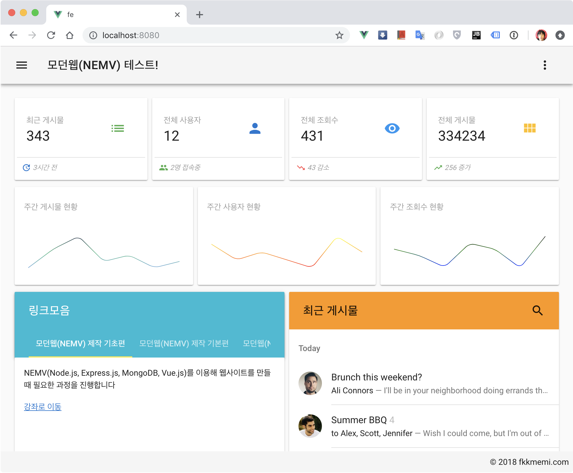
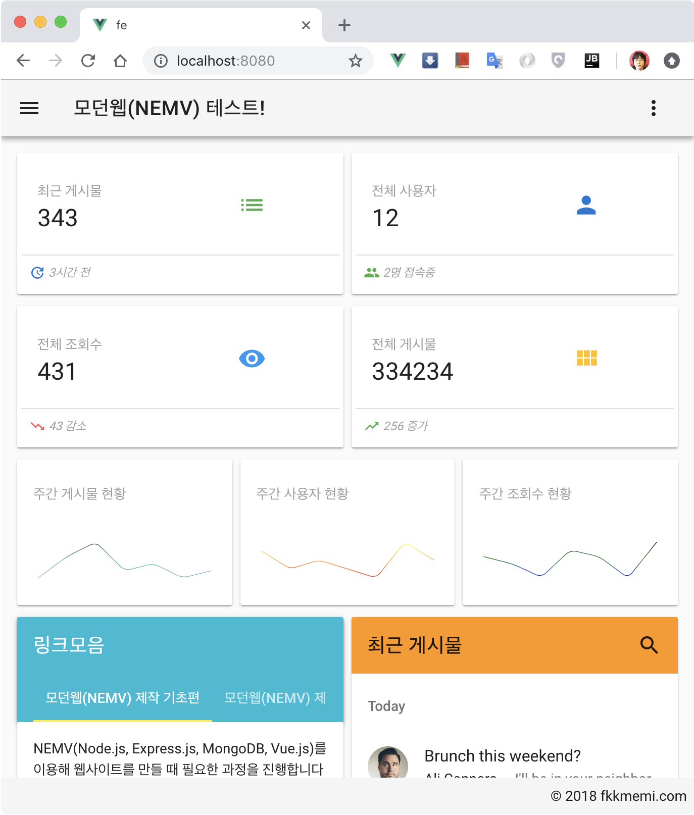
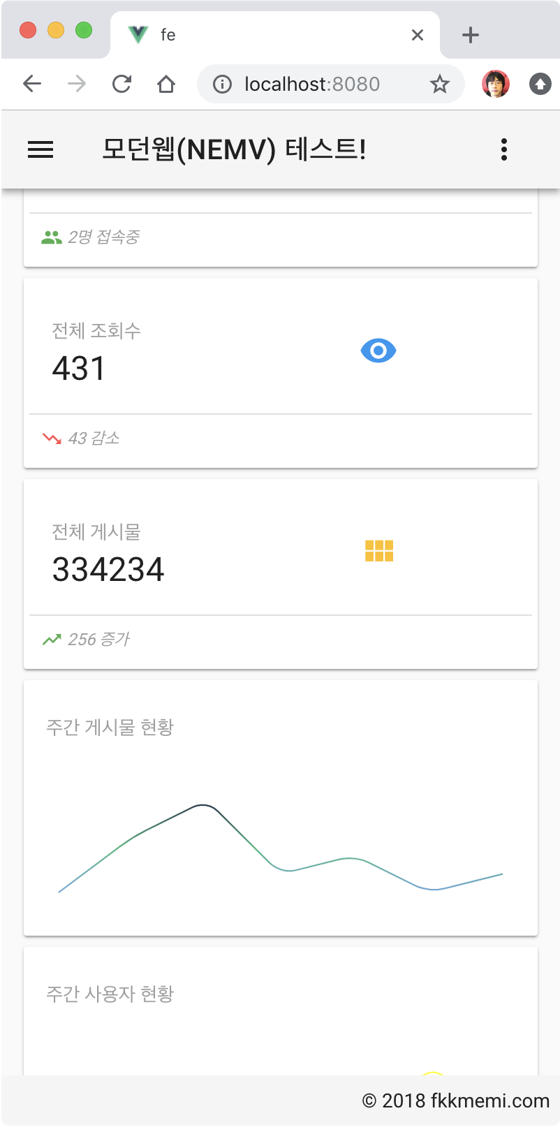
결과
적용 화면 다크
적용 화면 화이트 데스크탑
적용 화면 화이트 태블릿
적용 화면 화이트 모바일
마치며
이번 강좌에서 강조하고 싶었던 것은 화면을 설계하는 방법입니다.
다시 정리하면
배치 - 내용 채워보기 - 콤포넌트화
가 되는 것입니다.
지난 강좌에서 콤포넌트화는 안해도 상관 없었지만, 대시보드 처럼 많은 카드들이 있을 경우 콤포넌트화로 코드가 훨씬 간결해 졌음을 확인할 수 있습니다.
댓글남기기